
01 Challenge
Tad More needed a smoother way for visitors to move from interest to appointment. The problem was not just how the website looked, but how clearly it guided people toward action.
Project
A clearer booking experience for a tailoring and alterations service built around easier appointment scheduling.
Overview
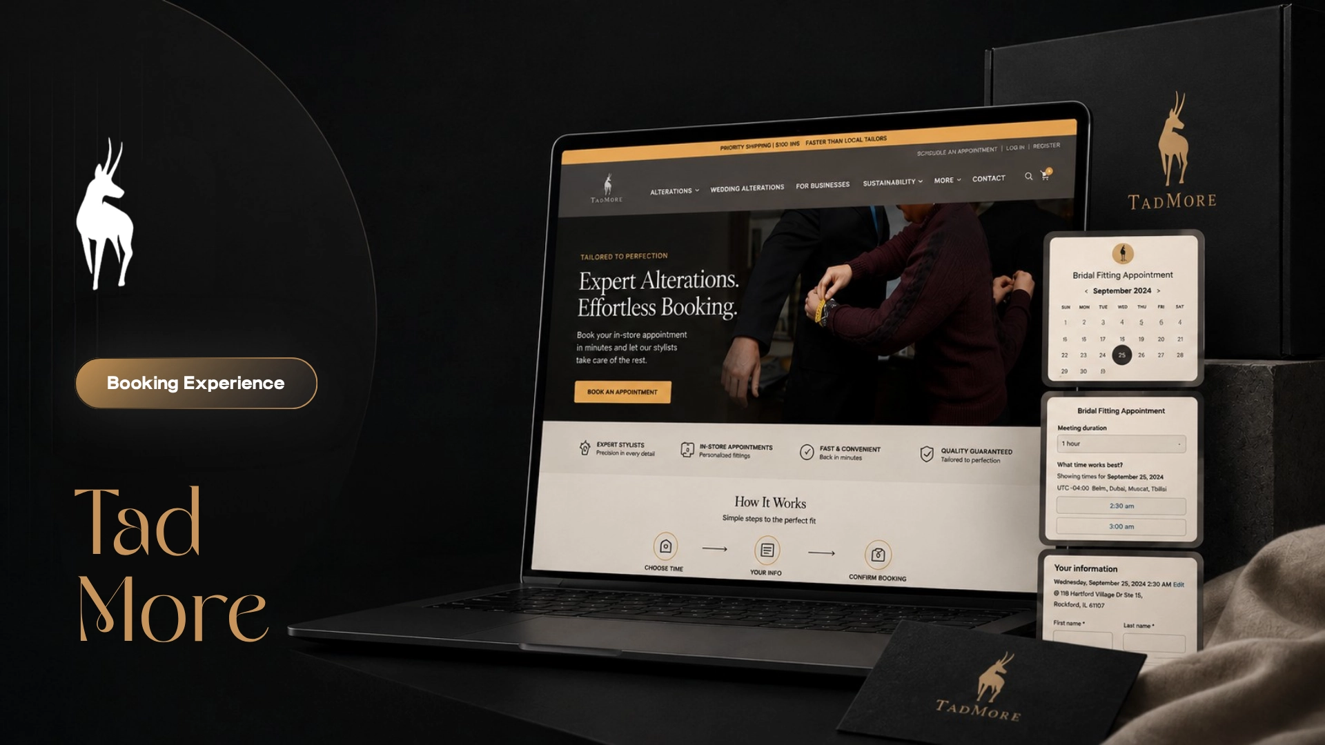
Tad More was a website improvement project focused on making the booking experience clearer, faster, and easier to use. The work centered on reducing friction in the appointment journey so visitors could understand the next step and move toward booking with less confusion.
Tad More needed a smoother way for visitors to move from interest to appointment. The problem was not just how the website looked, but how clearly it guided people toward action.
The direction focused on clarity, speed, and ease of use. The website experience needed to make booking feel simple, direct, and natural instead of slow or confusing.
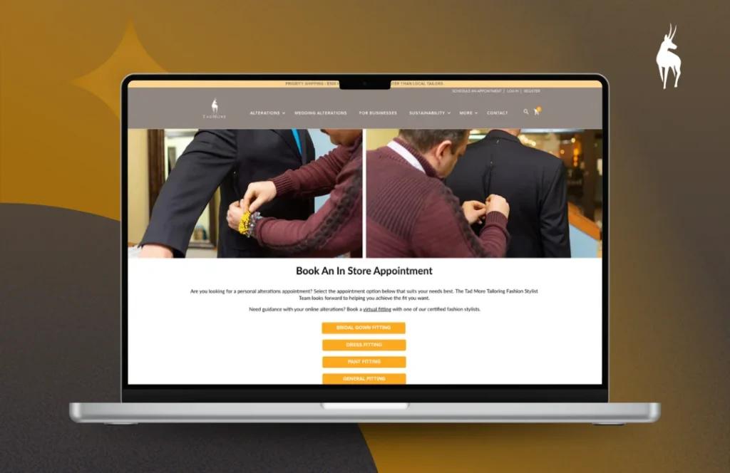
The website structure was improved around clearer navigation, stronger calls to action, and a more focused appointment path. Each page element needed to support the visitor’s next step instead of adding noise.
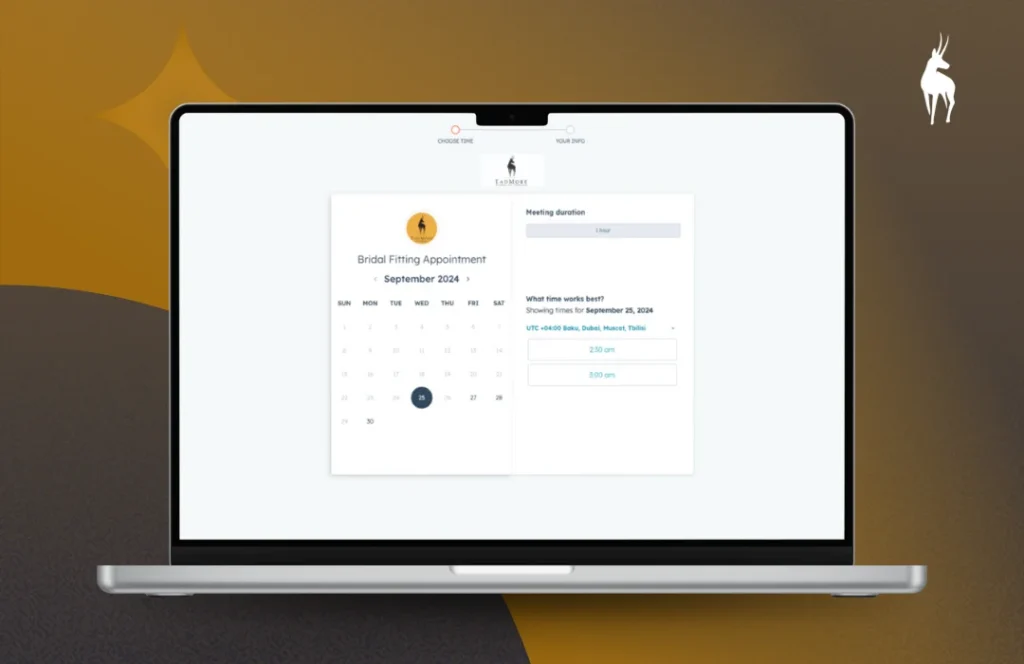
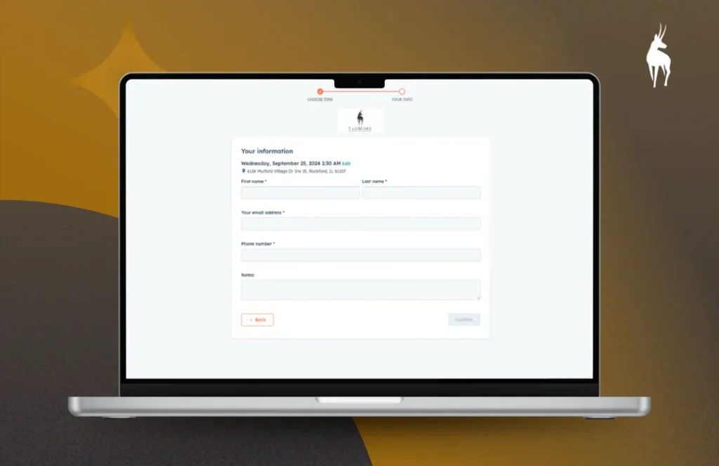
The booking experience was shaped to reduce friction. The goal was to make appointments easier to start, easier to understand, and faster for users to complete.
Tad More gained a clearer and more practical booking experience. The final improvements helped make the website easier to use and better aligned with appointment-driven customer action.
Visual System
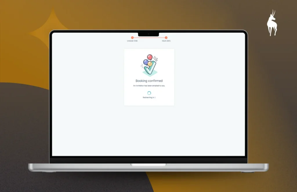
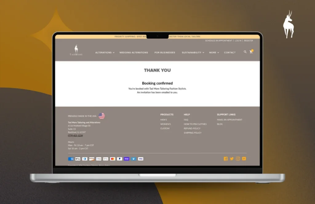
A website experience focused on the booking journey, showing the key scheduling steps from service selection to confirmation across desktop and mobile.
Start Here
Start with a focused project enquiry. I'll review the details and reply if it feels like a fit.