

Brand perception mistakes can cost you trust before people fully understand your offer.
That sounds unfair, but it is how people behave online. They do not wait until they have read every section, understood your process, studied your proof, and compared your value properly before forming an opinion.
They judge earlier.
They judge from the first few seconds of contact: the headline, the layout, the quality of the visuals, the clarity of the message, the tone of the writing, the way proof is presented, and whether the whole experience feels serious or generic.
Before someone fully understands your offer, they already have an opinion about your brand.
That opinion affects what happens next. They either keep reading, trust you enough to enquire, compare you with someone cheaper, or quietly leave.
This is why brand perception matters. Not because you need to impress everyone, but because the right people need to feel enough confidence to continue.
People decide what your brand is worth before they fully understand what you offer.
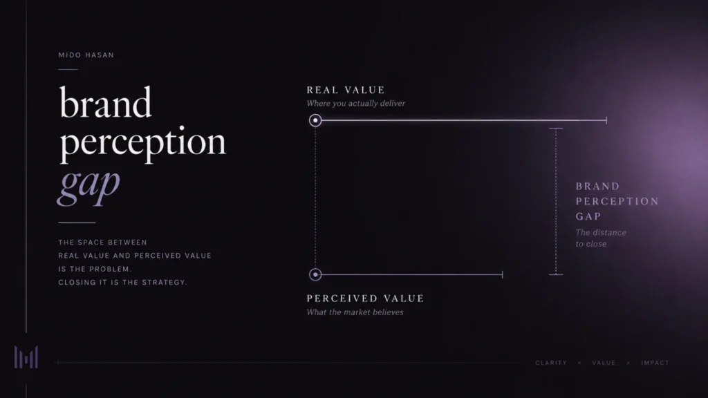
The brand perception gap behind these mistakes
A lot of strong businesses look weaker online than they really are.
The founder has experience. The work is valuable. The clients are happy. The offer can genuinely help people.
But when someone sees the brand from the outside, the value does not always come through clearly enough.
The website feels generic. The message sounds broad. The visuals feel disconnected. The proof exists, but it is buried. The offer is useful, but it is explained in a way that feels ordinary.
That is the brand perception gap.
The brand perception gap is the distance between how valuable your work really is and how valuable it appears when someone first meets your brand.
This gap is expensive because it creates doubt before the conversation even starts. It makes your price harder to justify. It attracts people who bargain instead of people who value the work. It makes good founders look less serious than they are.
And the worst part is that it does not always fail loudly.
You do not get a report saying, “A good client left because the website did not create enough trust.”
They just leave.
They do not enquire. They do not reply. They compare you with someone cheaper. They say they will think about it. They disappear after asking for the price.
That is not just a design problem. It is a business problem wearing design clothes.
Mistake 1: Your message is clear to you, but not to the buyer
The first mistake is assuming people understand your business because you understand it.
This happens all the time with founder-led businesses. The founder is close to the work. They know the offer, the process, the value, and the reasons behind every decision. But the visitor does not have any of that context.
They only have what the page gives them.
If the opening message is vague, the whole business feels harder to trust.
Lines like “we create meaningful digital experiences” or “helping brands grow through innovation” may sound polished, but they do not create clarity. They force the reader to translate the business in their own head.
That is a bad place to make people work.
A clear brand tells people:
- What you do.
- Who it is for.
- What problem it helps with.
- Why it is worth trusting.
- What should happen next.
Clarity is not basic. Clarity is a premium signal.
A confused brand can make a strong founder look average.
Mistake 2: Your visuals look nice, but not intentional
A lot of brands look fine at first glance.
The colors are clean. The typography is decent. The website feels modern enough. Nothing is obviously broken.
But “nice” is not the same as intentional.
Visual design creates a fast emotional signal. People may not understand spacing, hierarchy, typography, art direction, or brand systems, but they can feel when something looks careless, generic, or disconnected from the value of the work.
This does not mean every brand needs to look expensive. That is the cheap misunderstanding.
The goal is not fake luxury. The goal is visual confidence.
A founder-led brand should look considered. The design should feel connected to the value of the work. The colors, typography, imagery, layout, and rhythm should all help the business feel more specific and more trustworthy.
When the visuals look like a template, the business starts feeling like a commodity.
When the visuals feel intentional, the offer gets more room to be taken seriously.
Same work. Different frame. Different reaction.
Mistake 3: Your website looks good but does not reduce doubt
A website should not only look good. It should reduce doubt.
This is where many good businesses lose serious buyers. The website has pages, sections, services, and a contact form, but the experience does not build enough confidence.
Trust is created through structure. It comes from useful content, clear navigation, visible proof, consistent messaging, real details, and a page flow that answers the buyer’s questions in the right order.
This is also why website credibility matters. People look for signs that the business is real, capable, transparent, and worth taking seriously.
A better website should answer the questions a serious buyer is already thinking:
- Is this for me?
- Do they understand my problem?
- Can I trust them?
- Is the work valuable enough?
- What makes this different?
- What should I do next?
When those questions are answered well, the sales conversation starts from a stronger place.
Instead of spending the first call trying to prove that you are credible, your website has already started doing that work.
That is what trustworthy design should do. It should make people feel more confident as they move through the experience.
Mistake 4: Your proof exists, but it is not doing enough work
Proof is not just “logos we worked with” or a few nice testimonials.
Proof should help people believe the decision is safe.
That means your case studies, testimonials, project descriptions, screenshots, process notes, and results should make the value of your work easier to understand.
A weak proof section says, “Look, we did some work.”
A stronger proof section says, “Here is what needed to change, why it mattered, what decisions were made, and how the work helped the business become clearer or more trusted.”
This matters because people do not only buy the final design. They buy the judgment behind it.
If your proof only shows the surface, people may admire the visuals but miss the value.
That is a dangerous little leak.
Pretty screenshots can attract designers. Clear case studies attract buyers.
Mistake 5: Your tone makes the business feel smaller
Tone tells people what kind of business they are dealing with.
If the writing sounds too generic, the brand feels generic. If the writing sounds too desperate, the offer feels cheaper. If the writing sounds too corporate, the business feels distant. If the writing sounds too clever, the message becomes harder to trust.
The right tone depends on the brand, but for most founder-led businesses, the strongest tone is clear, specific, human, and confident without arrogance.
You do not need to sound like a fake big agency.
You also do not need to sound like a freelancer begging for a project.
There is a better middle ground: serious but approachable, strategic but understandable, premium but human.
Good tone makes people feel there is a real person behind the business and a clear mind behind the offer.
That matters more than most founders think.
Mistake 6: Your price appears before enough value is felt
People do not judge price in isolation.
They compare price against perceived value.
If your brand looks generic, your price feels higher. If your message is unclear, your price feels risky. If your proof is weak, your price feels harder to justify. If your website feels careless, your offer feels less reliable.
This is why two businesses can offer similar services and receive very different responses.
One gets questioned, negotiated, delayed, and compared.
The other feels more trusted before the first call.
The difference is not always skill. Sometimes it is brand perception.
That does not mean a strong brand can save a weak offer. It cannot. A better website will not magically create value that is not there.
But when the value is already real, the brand and website should not make people work so hard to see it.
Mistake 7: Your next step feels unclear or too heavy
Even if people trust the business, they still need to know what to do next.
This is where many websites become vague.
The call to action is either too weak, too aggressive, or too hidden. Sometimes every button says something different. Sometimes the enquiry process feels like a black hole. Sometimes the page builds interest but does not guide the visitor anywhere useful.
A good next step should feel natural.
It should match the level of trust already built.
If someone is reading a serious brand or website article, they may not be ready to “book a call now” immediately. But they may be ready to start an enquiry, request a diagnosis, or understand how the process works.
The CTA should not beg. It should guide.
Strong brands do not chase people around the page shouting for attention. They create enough clarity and confidence that the next step feels obvious.
That is the difference.
Brand perception mistakes are not small details
These brand perception mistakes are easy to underestimate because they do not always look dramatic.
A vague headline still looks like a headline. A weak proof section still looks like proof. A generic website still technically works. A confusing CTA still looks like a button.
But together, these small issues shape how people judge the business.
They affect whether people keep reading, whether they trust the offer, whether the price feels justified, and whether the right buyers feel confident enough to start the conversation.
Good branding is not about making a business look bigger than it is.
It is not about fake luxury. It is not about pretending to be a large agency. It is not about using dramatic words to cover weak thinking.
For founder-led businesses, the strongest brand is often the clearest one.
It should feel focused, serious, human, and specific. It should make the founder’s thinking visible. It should make the offer easier to understand. It should make trust easier to build.
That is where strategic design matters.
The work is not just choosing colors or arranging sections. The work is deciding how the business should be understood, what needs to be emphasized, what needs to be removed, and how the experience should guide someone from curiosity to confidence.
A strong brand presence does not create fake value.
It makes real value easier to recognize.
Start with a brand and website diagnosis
Before you redesign everything, you need to understand what is actually weakening trust.
Sometimes the issue is positioning. Sometimes it is the homepage message. Sometimes it is the proof. Sometimes it is the visual system. Sometimes it is the offer structure. Sometimes the website simply does not guide people clearly enough.
Do not guess.
Look at the brand the way a serious buyer would look at it.
Ask:
- Is the value clear in the first few seconds?
- Does the website create trust before asking for action?
- Does the visual system match the level of the work?
- Is the proof easy to find and understand?
- Does the tone feel specific and human?
- Does the offer feel valuable before the price appears?
- Does the next step feel clear and natural?
These questions are uncomfortable, but useful.
Because if your work is strong, your online presence should not make it look smaller.
It should help the right people see the value sooner, trust the business faster, and move forward with more confidence.
If your business is stronger than the way it currently appears online, start with a brand and website diagnosis.
A sharper brand presence will not fix a weak offer.
But if the value is already there, fixing the right brand perception mistakes can make that value much easier to recognize.