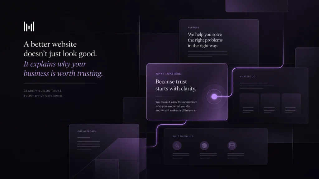
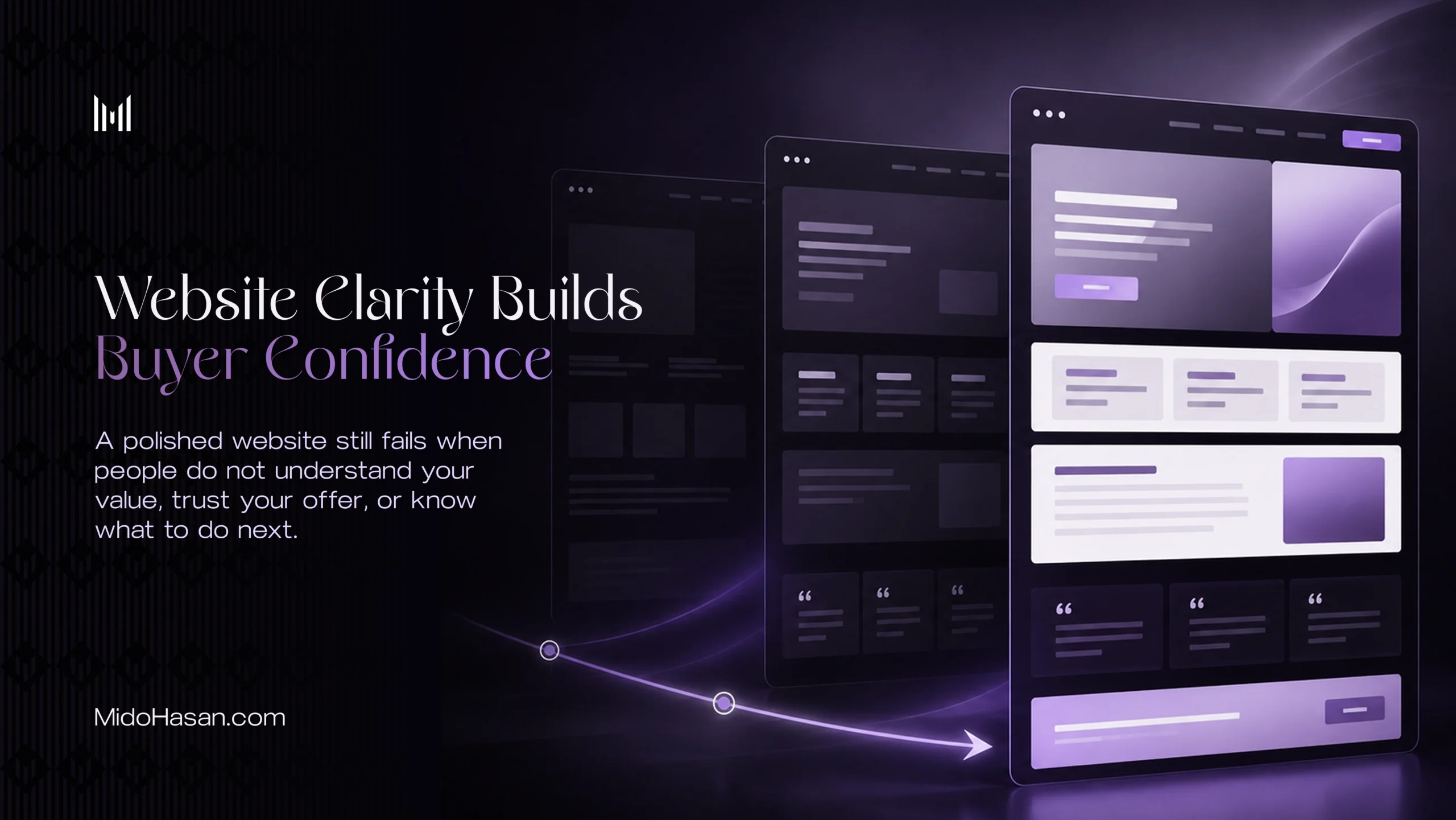
A polished website can still fail if people do not understand what makes the business valuable.
That is where many founders get misled. They look at the colors, spacing, typography, animations, and general visual quality, then assume the website is doing its job because it looks better than before. Better-looking is useful, but it is not the same as clearer, more trusted, or easier to choose.
A website can feel modern and still leave people unsure about what the business does, who it is for, why the offer matters, why it should be trusted, or what they should do next. When that happens, the design may attract attention, but it does not build enough confidence to move people forward.
That is why website clarity matters. Website clarity helps people understand your value faster, trust your offer more easily, and feel more confident taking the next step.
Good design is not the full job
Good design matters. A weak visual impression can make a strong business feel smaller, cheaper, or less serious than it really is. But design is not supposed to work alone.
A beautiful website with unclear messaging is still unclear. A premium layout with vague positioning is still vague. A polished homepage with weak proof is still hard to trust. The design may create a better first impression, but if the thinking behind the page is not clear, that first impression does not have much to hold onto.
The real job of a website is not only to impress people for a few seconds. Its job is to help the right people understand whether the business is relevant, credible, and worth choosing.
Most visitors are not reading every word carefully. They scan. They compare. They look for signals. They ask silent questions while moving through the page: Do I understand this? Is this for me? Do they understand my problem? Can I trust this? Is this worth my time, money, or attention? What should I do next?
If the website does not answer those questions clearly, people usually do not complain. They simply leave, delay, compare you with someone else, or ask for the price before they understand the value.
That is how weak website clarity quietly costs trust.
The first problem is usually unclear value
Many founders think their website problem is visual. Sometimes they are right. The site may look outdated, inconsistent, or too light for the level of work behind the business.
But very often, the deeper issue is value clarity. The business may be strong, but the website does not explain that strength in a way people can quickly recognize.
The headline may sound nice, but it’s not specific. The service section may list what is offered, but not why it matters. The about section may feel personal but not commercially useful. The portfolio may show good visuals, but not the thinking behind them. The call to action may exist, but people do not feel ready to click it.
None of these details feels like a huge problem on its own. Together, they create hesitation.
A visitor should not have to work hard to understand why your business matters. If they need to guess, translate, connect missing dots, or scroll too far before the value becomes clear, the website is creating friction.
This is closely connected to brand perception mistakes, because people often make early judgments before they fully understand the offer. If the website feels unclear, the business can feel less serious, less trusted, or easier to compare with cheaper options.
That may not be fair, but it is how people behave online.
Website clarity builds trust before the enquiry
A strong website prepares the sales conversation before it happens.
By the time someone enquires, they should already understand the main value, feel some trust, and know why the next step makes sense. The website does not need to answer every possible question, but it should reduce the most important doubts.
That means the order of information matters. The tone matters. The proof matters. The page structure matters. The call to action matters. Trust is not built by writing “trusted by” or “premium service” on a page. Everybody can say that. Trust is built when the whole experience feels considered, specific, useful, and consistent.
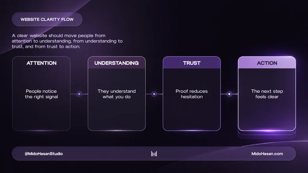
A website with strong clarity guides people from attention to understanding, then from understanding to confidence. It gives visitors enough context to feel that the business understands the problem, has a clear way of solving it, and has proof behind the claim.
That is also why website trust mistakes are expensive. A website can look good and still fail to reduce doubt. If the proof appears too late, the service sounds generic, the process feels unclear, or the page asks for action before building confidence, the visitor may not be ready to enquire.
Website clarity is not just about simpler wording. It is about helping people feel safe enough to continue.
What a clear website should communicate
A clear website does not need to say everything. It needs to say the right things in the right order, so people can quickly understand what the business does, why it matters, and whether it is relevant to them.
At a minimum, your website should make a few things easy to understand: what you do, who it is for, why the problem matters, how your offer helps, why your approach is different, what proof supports the claim, and what the next step looks like.
This sounds basic, but many websites miss it because they are built around sections instead of decisions. A visitor is making decisions the entire time: should I keep reading, should I trust this, should I compare, should I enquire, or should I leave?
Every section should help answer one of those questions. If a section exists only because “websites usually have this section,” it may be adding noise instead of clarity.
For service businesses, clarity shows judgment
For service-based founders, consultants, experts, studios, coaches, and personal brands, the website is not only selling deliverables. It is selling judgment.
People are not just buying a website, brand identity, strategy session, consulting offer, coaching package, or service. They are buying the belief that you understand the real problem and can guide them properly. That belief has to be built before they reach out.
A clear website helps by making your thinking visible. Not through long, complicated explanations, but through specific positioning, useful language, meaningful proof, and a process that feels calm and intentional.
This is where a founder-led brand can be powerful. When the person behind the work is visible, accountable, and clear, the business can feel more human and more trustworthy. But if the website feels casual, vague, or underdeveloped, founder-led can accidentally look small.
Founder-led does not mean small. It should mean clear, direct, and accountable.
For online stores, clarity builds buying confidence
For e-commerce and online stores, website clarity has a different job. It needs to help people feel confident enough to buy.
A store may look attractive and still lose buyers because the product value is unclear, the product page does not answer enough questions, the brand feels inconsistent, the checkout feels uncertain, or the buying journey creates unnecessary doubt.
People may like the product and still hesitate. That hesitation often comes from missing clarity.
The store needs to help people understand what the product is, why it is worth the price, who it is for, what makes it different, whether the brand can be trusted, what happens after they order, and whether the buying process feels safe and simple.
Online store design is not just about displaying products beautifully. It is about improving product perception, buyer confidence, and sales readiness.
This is why checkout usability research matters. Small points of friction can weaken confidence at the exact moment someone is close to buying. A clear online store makes the product easier to understand, easier to trust, and easier to buy.
When a website needs more than polish
Not every website needs a full rebuild.
Sometimes the foundation is strong, but the message needs tightening. Sometimes the proof needs to be moved higher. Sometimes the homepage needs clearer hierarchy. Sometimes the call to action needs a better lead-in. Sometimes the offer needs to be explained with more confidence.
But if the positioning is unclear, the offer is too broad, the structure feels scattered, and the design does not match the real value of the work, then small fixes may not be enough.
That is when the website needs strategic thinking before visual refinement.
A redesign should not only make the website look better. It should make the business easier to understand and trust. Before changing the visuals, it is worth asking whether the value is clear in the first few seconds, whether the homepage explains who the offer is for, whether proof appears where doubt naturally happens, whether the design matches the level of the work, and whether the structure guides people toward the next step.
If the answer is weak, the issue is not only design. It is clarity.
Clarity makes value easier to recognize
The best websites do not make people work hard to understand the business. They make value easier to recognize.
They help the right people feel oriented. They create confidence through structure. They make the offer feel specific. They use proof in the right places. They guide action without pressure. They make the business feel as serious as the work behind it.
That is what website clarity does. It turns a good-looking website into a more useful business asset.
A website is not finished just because it looks polished. It is finished when the right people can understand the value, trust the offer, and know what to do next.
If your website looks good but people still do not understand, trust, or enquire, start with a brand and website diagnosis.
A polished website can attract attention. A clear website builds buyer confidence.