Website trust mistakes can make a good business look harder to choose before people even understand the offer properly.
That is the uncomfortable part.
Most founders think their website problem is visual. They want it to look cleaner, sharper, more premium, more modern, or more impressive. Sometimes they are right. Bad visuals can damage trust quickly.
But a website can look good and still fail.
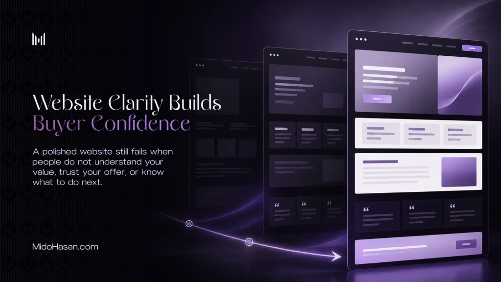
It can have clean spacing, nice colors, smooth animations, strong photography, and a polished layout while still leaving people unsure about what the business does, why it matters, and whether they should take the next step.
That is where the real problem begins.
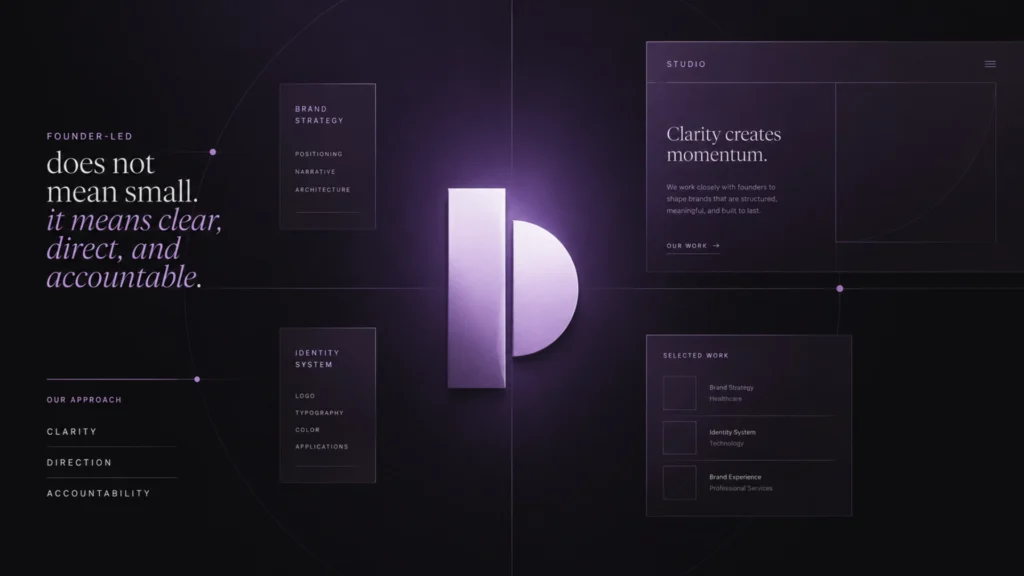
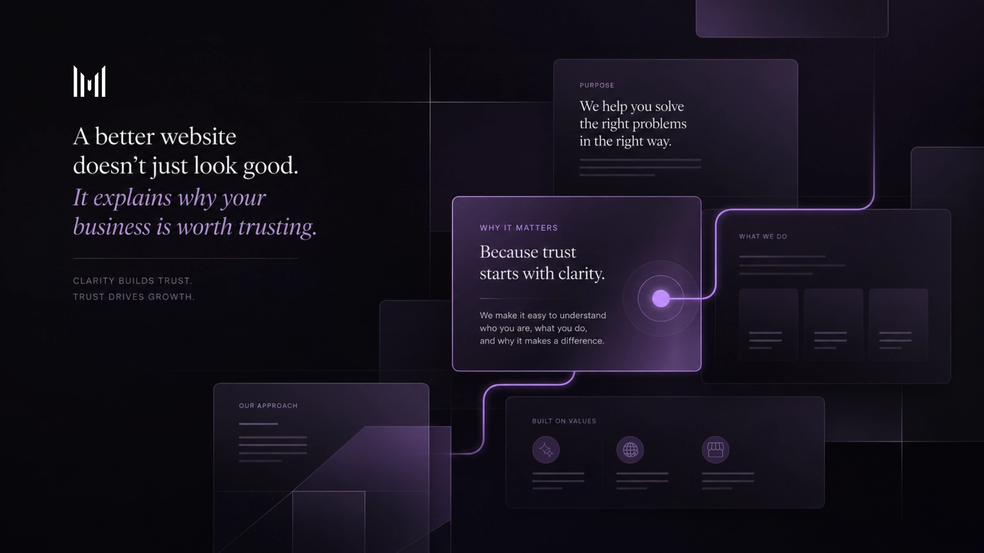
A better website is not just a nicer version of the old one. It is a clearer structure for trust. It helps people understand the business, believe the value, see the proof, and feel confident enough to act.
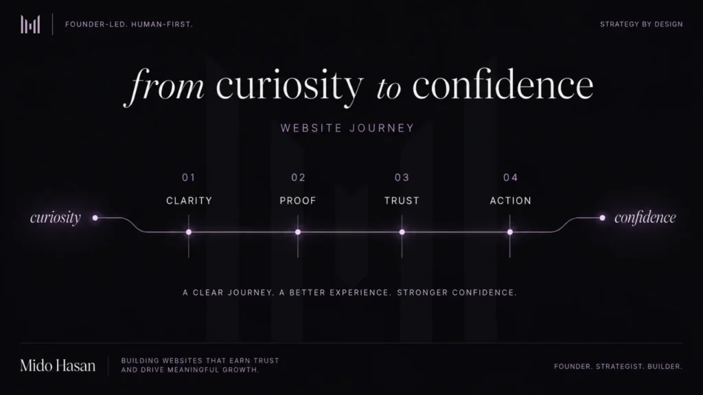
A website is not only a place to show information. It is a structure that helps people move from curiosity to confidence.
The trust gap behind these website trust mistakes
Most weak websites do not fail because every part is terrible.
They fail because small doubts keep stacking up.
The headline is almost clear, but not quite. The service section explains what is included, but not why it matters. The proof exists, but it appears too late. The visuals look nice, but they do not feel specific. The call to action is visible, but the visitor does not feel ready yet.
None of these issues looks dramatic on its own.
Together, they create a trust gap.
The trust gap is the distance between what a visitor needs to believe before taking action and what the website actually helps them believe.
That gap is expensive because most people will not explain it to you. They will not send a polite message saying, “I was interested, but your website did not reduce enough uncertainty for me.”
They just leave.
They close the tab. They compare you with someone else. They ask for the price too early. They say they will think about it. They disappear before the conversation begins.
That does not always mean the offer is weak.
Sometimes the offer is strong, but the website does not frame it properly. This is closely connected to brand perception mistakes, because people often judge the value of a business before they fully understand what it offers.
Mistake 1. The homepage makes people work too hard
The homepage is not there to impress everyone.
It is there to help the right people quickly understand why they should care.
That means the first section cannot be vague. If your hero section says something like “we create digital experiences for modern brands,” you may think it sounds polished, but to a serious buyer, it usually means almost nothing.
Modern how?
Digital what?
For who?
What problem is being solved?
Why should I keep reading?
People should not need five minutes to decode the basic offer. If the first screen creates confusion, the rest of the page has to work twice as hard.
A strong homepage creates orientation. It helps people understand:
- Who the website is for.
- What problem the business solves.
- What kind of value the offer creates.
- Why the approach is worth trusting.
- What the visitor should do next.
This does not mean the homepage should explain everything at once. That would be another kind of disaster. It means the first impression should give the visitor a clear reason to stay.
Mistake 2. The structure adds sections instead of building trust
A lot of founders try to fix a weak website by adding more.
More sections. More animations. More testimonials. More service blocks. More icons. More “about us” text. More noise wearing a nice suit.
But more content does not automatically create more trust.
Sometimes it creates more confusion.
A better website is not built by throwing every piece of information onto the page. It is built by deciding what the visitor needs to understand first, second, third, and fourth.
That sequence matters.
A useful website should be shaped around helpful, reliable, people-first content, not just pages created to fill space or satisfy a checklist.
A strong website should guide the visitor through a clear path:
- Understand the problem.
- Understand the offer.
- Understand the approach.
- See relevant proof.
- Know what action to take.
When the structure is clear, the website feels calm. When the structure is weak, the website feels like a room where every object is shouting for attention.
The founder may not notice this because they already understand their own business. Visitors do not have that context. They need the website to create it.
Mistake 3. The website looks good, but doesn’t reduce doubt
A website should not only present the business. It should reduce doubt.
This is where many good businesses lose serious buyers. The page has services, sections, testimonials, and a contact form, but the experience does not build enough confidence.
Trust is created through structure, proof, clarity, and useful detail. It comes from the way the offer is explained, the way the navigation works, the way case studies are placed, the way objections are answered, and the way the next step is framed.
A better website should answer the silent questions already running through a serious buyer’s mind:
- Is this for me?
- Do they understand my problem?
- Can I trust them?
- Is the work valuable enough?
- What makes this different?
- What should I do next?
If the website does not answer those questions clearly, people hesitate. And hesitation is expensive.
Mistake 4. Proof appears too late or in the wrong place
Most websites treat proof like decoration.
They put testimonials in one section, case studies somewhere else, logos in a strip, and then hope the visitor connects the dots.
Hope is not strategy. It is procrastination with perfume.
Proof should appear where hesitation happens.
If the visitor is reading about your offer, show proof that the offer works. If they are reading about your process, show proof that the process is structured. If they are considering whether you understand their type of business, show a relevant case study. If they are close to enquiring, show a trust signal before the call to action.
Proof should not sit quietly in a corner like a polite guest.
It should support the exact moment where the visitor may hesitate.
This is also why case studies matter. Not just screenshots. Not just pretty layouts. A good case study should explain what changed, why it changed, and how the design helped the business become clearer, sharper, and more trusted.
Visual proof gets attention.
Strategic proof builds confidence.
You need both.
Mistake 5. The design competes with the message
A website can be over-designed.
This happens when the visual system becomes louder than the business itself. Too many effects, too many animations, too many layout tricks, too many gradients, too much “look what I can do.”
At that point, the website becomes a designer’s performance, not a business tool.
Good design should create hierarchy, clarity, rhythm, and trust. It should make the important things easier to notice. It should make the message easier to understand. It should make the offer feel more credible.
It should guide attention without making the visitor feel like they are walking through a nightclub with a contact form.
The best websites often feel simple from the outside, but very intentional underneath.
Simple does not mean basic.
Simple means the unnecessary has been removed.
Mistake 6. The call to action asks before trust is built
A call to action does not work because the button is brighter.
It works because the page has built enough confidence before asking for action.
If the website has not explained the offer, built trust, answered objections, or made the value clear, the button has to carry too much weight. That is why “book a call” can feel too aggressive on a weak page.
The visitor is not ready yet.
They still have questions. They still do not know if the service is for them. They still do not know if the business understands their situation. They still do not know what kind of process or investment to expect. A better website makes the action feel natural.
The visitor should reach the call to action thinking:
- This seems relevant.
- This feels serious.
- This person understands the problem.
- There is enough proof here.
- The next step makes sense.
That is when an enquiry form, call request, or diagnosis offer becomes easier to accept.
For e-commerce websites, checkout usability research shows the same principle clearly: small moments of friction can weaken confidence right before action.
The button is not the strategy.
The page before the button is the strategy.
Mistake 7. The website does not prepare the sales conversation
A good website does not replace sales.
But it should make sales easier.
Before someone speaks with you, the website should already have done some of the heavy lifting. It should explain your positioning, show the type of problems you solve, communicate your standards, filter out poor-fit buyers, make serious buyers feel understood, and show enough proof to reduce risk.
This matters even more for founder-led businesses, because the website often has to communicate both the value of the offer and the credibility of the person behind it.
When this happens, the sales conversation changes.
You spend less time explaining basic credibility. You spend less time defending the price. You spend less time convincing people that design matters.
You spend more time discussing the actual problem, the right scope, and whether the fit is strong. That is where you want the conversation to be.
A weak website creates cold conversations. A strong website creates warmer ones.
Not because it manipulates people. Because it prepares them.
Website trust mistakes are not fixed by decoration
Visual design matters.
A lot.
Bad visuals can damage trust quickly. A messy website can make a serious business feel careless. A cheap template can make a premium offer feel less believable.
So no, design is not optional.
But visual design is only the visible layer.
Underneath the surface, a strong website needs strategy: positioning, messaging, structure, proof, hierarchy, user flow, conversion logic, trust signals, and clear next steps.
If those things are weak, better visuals will only make the weakness prettier.
That is not enough.
A website should not just look better. It should think better. It should explain the business better. It should make the value easier to recognize. It should help the right people feel more confident taking the next step.
That is what separates a redesign from a strategic rebuild.
Start with a website trust diagnosis
Before you redesign everything, understand what is actually weakening trust.
Sometimes the issue is visual quality. Sometimes it is the homepage message. Sometimes the offer is not clear enough. Sometimes the proof is weak or hidden. Sometimes the tone does not match the price. Sometimes the calls to action appear before enough confidence has been built.
Do not guess.
Look at the website the way a serious buyer would look at it.
Ask:
- Is the value clear in the first few seconds?
- Does the page answer the buyer’s silent questions?
- Does the structure guide attention in the right order?
- Is proof placed where hesitation happens?
- Does the design support the message instead of competing with it?
- Does the CTA feel like a natural next step?
- Does the website prepare a better sales conversation?
These questions are uncomfortable, but useful.
Because if your website looks fine but people still do not understand, trust, or enquire, the problem is probably not just design polish.
It is strategy.
And strategy is what turns a website from a digital brochure into a business asset.
If your website looks fine but people still do not understand, trust, or enquire, start with a brand and website diagnosis.
A better website will not save a weak offer.
But if the value is already there, fixing the right website trust mistakes can make that value much easier to understand, believe, and act on.